k12 insight
DATA VISUALIZATION

problem
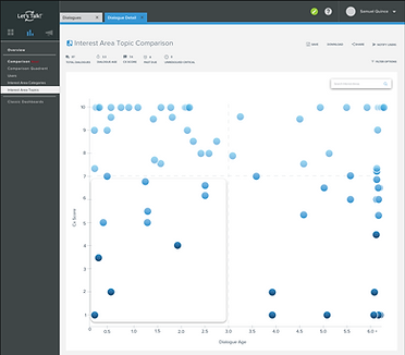
Currently, a comparison chart exists that shows the correlation between the district's Cx score to their Dialogue Age, however it fails to provide an all encompassing visual aid. The task was to create a way for users to visually see which topics and teams are excelling and which ones could use improvement.
solution
A four quadrant interactive grid that allows users to set their own standards as well as provide well rounded filters to assess how well they are doing from all angles.
result
A visual aid that is able to adapt to the standards of each district. Users see how their Cx Scores correlate with Dialogue Age and are able to take appropriate action to positively encourage Interest Areas that are lacking in the customer service department as well as reward those that are providing stellar service.It is another method of keeping themselves accountable for proper customer service.
summary
Within the Let's Talk! Dashboard a Comparison section had already existed. There were three different comparison report types: User - a report to assess how well LT! users are performing, Interest Area - a report to assess which Interest Areas are being utilized most and Interest Area Category - a report to assess the umbrella under which the Interest Areas are housed.
Report results are based off of Cx Score - customer experience score based off of rating feeding back LT! customers provide LT! users and Dialogue Age - how long it took for the Dialogue to be resolved. A Dialogue is the customer inquiry received by our users' users.
While a comparative bar graph existed it only demonstrated the Cx Score and Dialogue Age of an individual User, Interest Area or Interest Area Category. There was no way for the user to view a comprehensive report that demonstrated how all users, interest area and interest area categories compared to one another.
Using competitive analysis research and data visualization techniques, a four quadrant interactive grid was developed as a means to help our users find patterns within their LT! accounts and provide another way to hold themselves accountable for upholding higher standards of customer service.
team
Rachel Morin
role
UX/UI Designer
what do our users need?
INTERVIEWS AND COMPETITIVE ANALYSIS
interviews

Our LT! Implementation Team is closest with our users. They train each kind of user on how to set up and use the LT! account. System Administrators - users that have access to all of the information on their LT! accounts, usually the point of contact for that district (Superintendent or Director of a department) have seperate trainings. The point of contacts usually report back to our LT! Team with any questions, comments or concerns which they relay to us.
In order for me to understand just how intensive this visual aid had to be I interviewed members of the LT! Team and here is the information I received.
-
Districts vary in size which means the amount of users vary, could be anywhere from 5 users to 50- depending on how deeply implemented LT! is within their district.
-
A small district would have 70-90 Interest Areas by the end of Phase 4 (about a year into implementation), a large district could have anywhere from 700-1000 Interest Areas.
-
Not all Interest Areas are used, but it is difficult to figure out which are being used or not.
-
Higher Cx Scores have a direct correlation to short response times-but the users don't always see that.
competitive analysis and inspiration
After discussing the pain points and observations of both our users and and LT! Implementation Team, it became clear that the visualization method would have to be able to:
-
Encompass and wide array of data
-
Utilize two comparison points that could work for three different report types
-
Be able to sort and filter flexibly due to the fact that each district has their own standards
-
Help users make connections on their own
For inspiration I looked to powerful graph making tools such as Tableau as well as Tim Leong's Super Graphic.
Since bar graphs are already in play and pie charts would become too overwhelming for the amount of data necessary, I turned to bubble graphs. They can be plotted on either a timeline or graph utilizing a X and Y axis as well as be easily made interactive.
They provide a fantastic visual aid, because they display easily identifiable patterns based on how they are plotted.


how will this look?
ITERATIONS


iterative decisions
-
Size will not be a factor due to the nature of the graph. The best and worst service can be easily identified based on the quadrant it belongs to.
-
Due to the flexible nature of LT! the graph needed to be flexible too. The X and Y axis are moveable and the data represented by the bubbles will move as well. For example, if a district has a set standard of answering Dialogues within two days a user can move the Y axis and set it on 2.0. That way the data shown in the first quadrant or Dialogues answered within two days with a high score of 8 and above.
-
The colors that we ended up going with red, LT! blue, and gray not only stay on brand but single out the two main quadrant that need focus - stella service and risk areas.
-
When hovered on the bubble display a brief overview of that particular piece of data such as user name, Interest Area name or Interest Area Category name as well as its associated Cx Score and Dialogue Age.
-
A mini version of the quadrant is set in the top left corner as a means of navigation. When clicked on that quadrant will expand and a detailed version of that quadrant will take the screen.
-
The original bar graph will be present underneath for individual comparisons.
-
The graph report underneath will list all respective data in alphabetical order unless a user decided to sort it but highest to lowest rating or longest to shortest closing out times.
-
The graph report can be drilled down by clicking on either the Dialogue Age bar, Cx Bar or content in the center. It will display the Dialogues involved with said user, Interest Area or Interest Area Category.
-
Within the drilldown is also the option to notify a user, Interest Area team owner or Interest Area category owner about their progress.
-
There is also the option to notify users by grouping. For example, those who are responsible for closing out a Dialogue within a certain amount of days or receiving a score of 8 and above.
-
Lastly, the filters are extensive and in accordance with our new Dashboard redesign will be applied to all comparison reports as well.
developed and deployed
ACTIVE FEATURE
